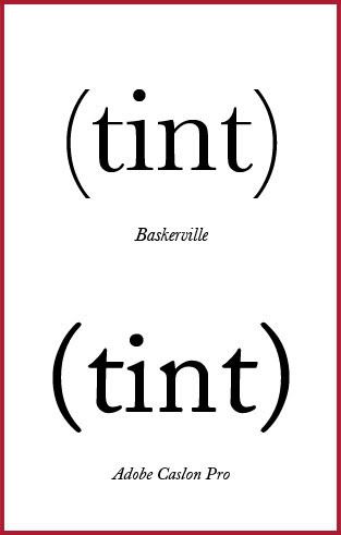
Was working on a project for school where I had to design a masthead for a fictional magazine. So playing around with fonts and such, I discovered this!
How amazingly cool is it that Baskerville's brackets are so gorgeously thin and light, that it looks like it belongs with a san serif typeface? And yet, it still matches the serif letters so well, since Baskerville I feel, has a relatively light stroke as it is. So nice.
(Not that there's anything wrong with Caslon, of course.)
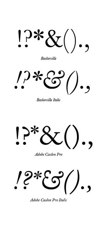
How about a closer look please! And you know I love italics, even more than how much I love san serifs in their thin/ultrathin versions.
Check out the even stroke of the ampersand (&) on Baskerville Regular compared to the Caslon. And the contrast on its comma is gorgeous. While I'm not to sure on the sharpness of its question mark, I really love the flourish on Baskerville Italic's ampersand and just look at the sharp tapered ends of the brackets!
Its quite an innovative solution too, I think, with regards to designing what the italicized form of the brackets should be. Ultrathin strokes on regular, and a slight belly in italics, to denote a really graceful shift in weight and angle.
Sigh.


No comments:
Post a Comment